
Nestify
Nestify
Region
Region
Africa
Africa
Year
Year
2025
2025


The project itself :
Nestify is a modern real estate platform designed to simplify how people discover and secure homes. It combines structured property search with community-driven insights, allowing users to explore listings, understand real living experiences, and connect directly with property owners without unnecessary intermediaries.
The housing process is often stressful, expensive, and lacks transparency. Users struggle to trust listings, avoid exploitative agent fees, and access honest insights about properties and neighborhoods before making decisions.
The goal was to design a seamless and trustworthy platform that makes home discovery faster, more transparent, and user-driven while reducing reliance on middlemen and improving decision-making.
I worked as the Product Designer, leading the end-to-end design process from defining the problem to delivering high-fidelity designs and interactive prototypes.
conducting research,
storyboarding,
paper and digital wireframing,
iterating on designs,
making high-fidelity prototype
All about the user :
I explored how users search for homes and make decisions, focusing on clarity, trust, and ease of navigation. The research showed that users struggle more with decision-making and transparency than just finding listings.
Users find platforms cluttered and difficult to navigate, making it hard to move from browsing to action.
Filters are either too broad or too complex, making it difficult to find homes that truly match user preferences.
Users lack trust due to limited transparency around property conditions, landlords, and real living experiences.
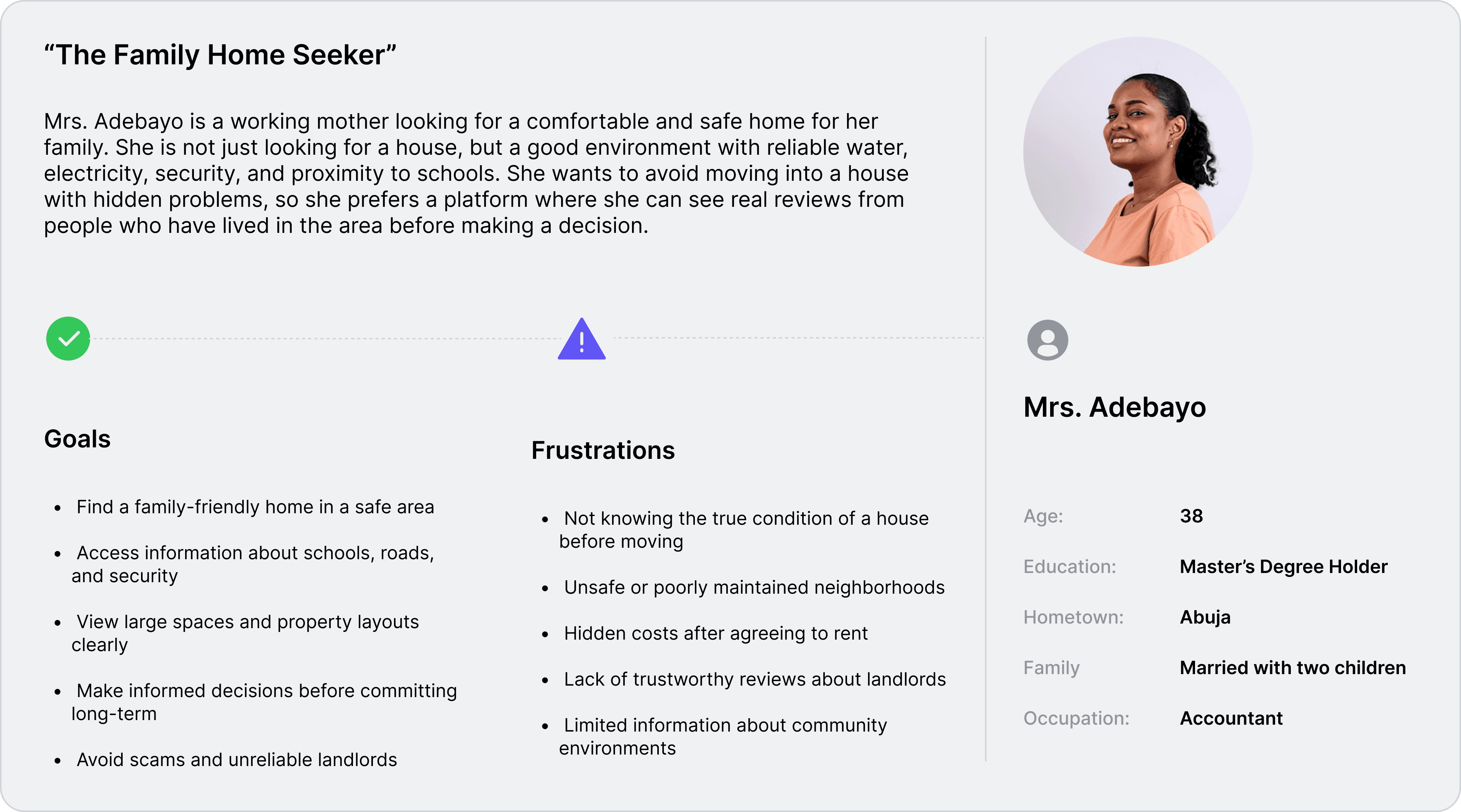
Personas were selected by conducting user research and identifying common pain points, that frustrate and block the user from getting what they need from a product.
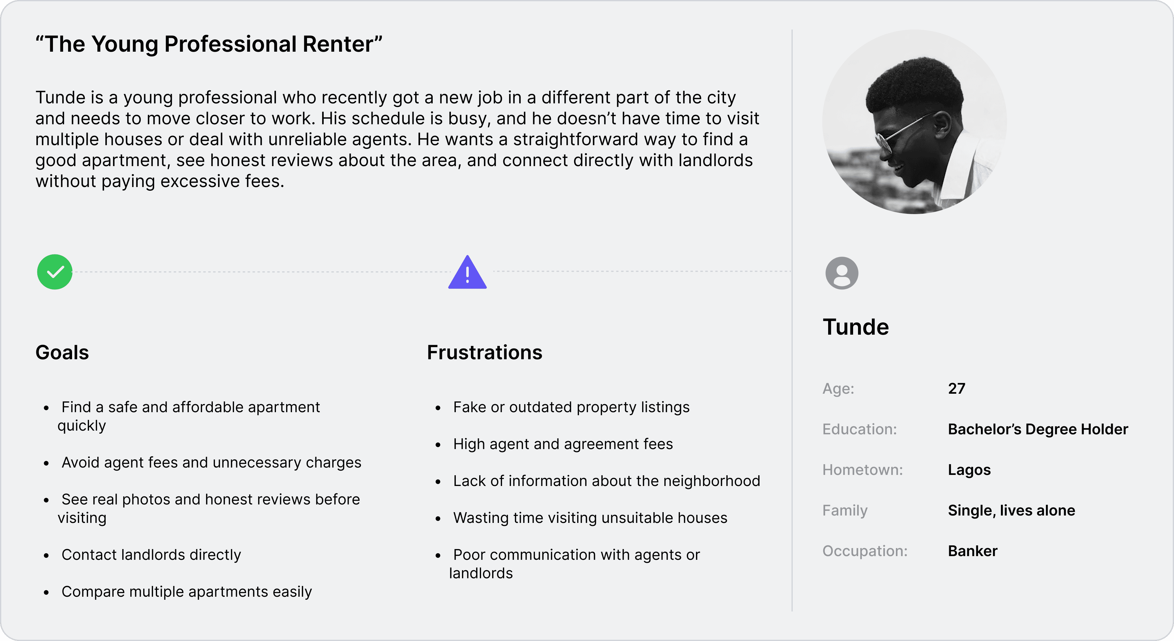

It is the series of experiences Tunde has as he achieve a specific goal. It was built on the his experience.
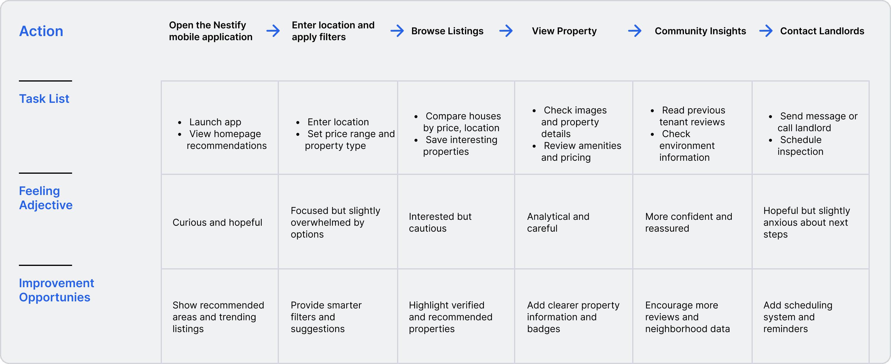
I developed a user journey map to analyze a user;s home search experience on Nestify, detailing actions, emotions, and improvement opportunities.
Find a suitable house in a preferred location, review property details and community insights, and contact the landlord in a clear and stress-free way.
The project schematically :
After completing user research and defining the product goals, I began the design process by mapping the product structure and user experience flow. I created storyboards, user flows, and wireframes to visualize how users would search for homes, review property information, and connect with landlords through the platform.
The series of hand-drawing frames that visually describe and explore a user's experience with a product.
I created storyboards to visualize the user’s journey before, during, and after using Nestify. This helped me understand the real-life context of house hunting, including searching for properties, evaluating neighborhoods, and contacting landlords. The storyboard helped align the product features with real user needs and experiences.
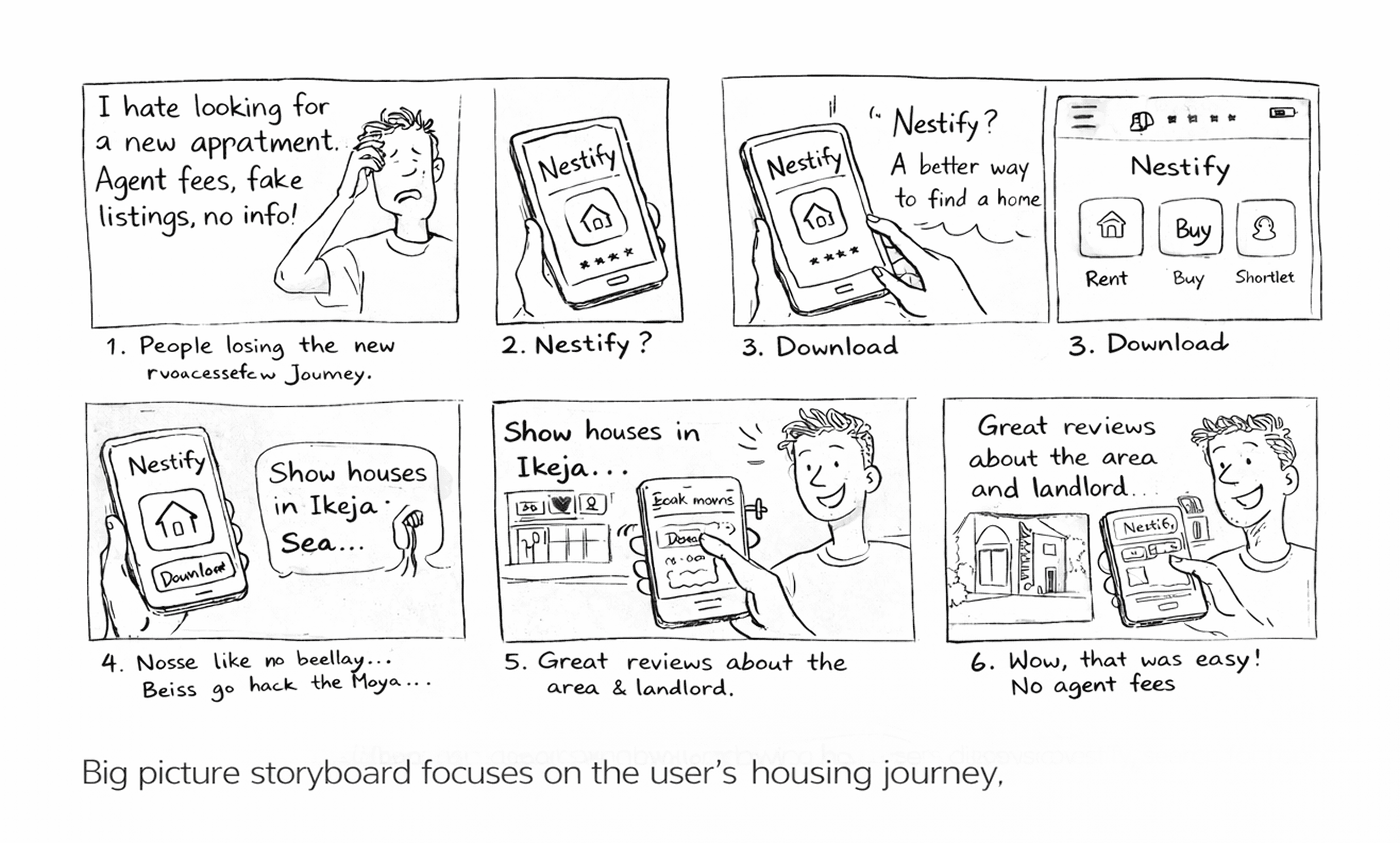
This storyboard illustrates the overall user experience, showing how users discover Nestify, search for homes, evaluate properties, and contact landlords. It focuses on the user’s real-life housing journey and the problems the platform is designed to solve.

This storyboard focuses on the in-app experience, highlighting how users navigate the platform, browse listings, view property details, read community insights, and communicate with landlords within the app.
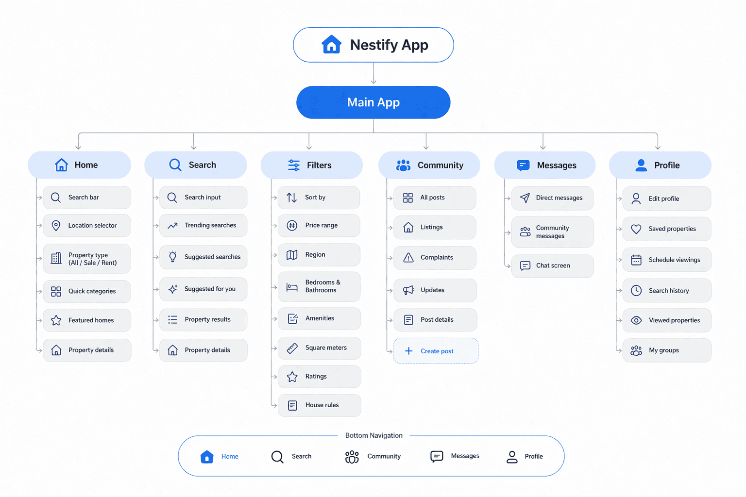
A structured layout that defines the app’s pages, navigation, and content hierarchy, ensuring users can move through the platform easily.
I created the app map to define the structure and navigation of Nestify. The goal was to organize property search, community insights, and landlord communication into a simple and intuitive flow.
They initially oriented on the basic structure of the homepage and highlight the intended function of each element.
Here I drew five different versions of how structure of information on a homepage might look like. Then I reviewed all the versions and combined them in the refined one.
The goal was to explore different ideas with wireframes.

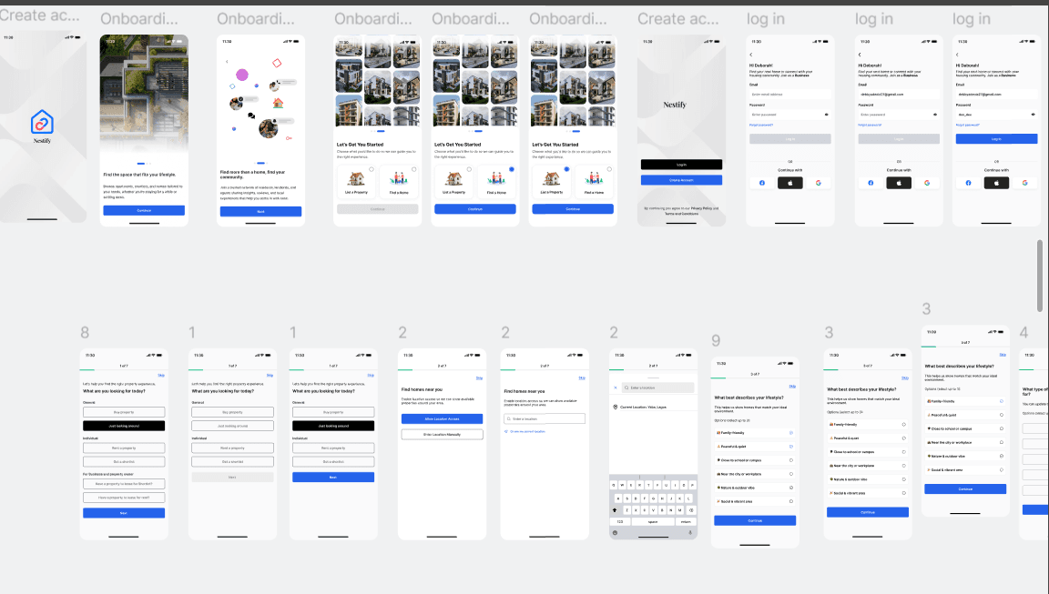
More "clear" version of wireframes in a digital form. Also all the important pages are added
in it.
On this step I used the Figma design tool to create digital wireframes of all the pages. Then I bonded all of them into the clear and smooth structure.
The goal is to show how all the pages and things interact with each other.

This is an examination of users and their needs, which adds realistic context to the design process.
This phase focused on understanding user behaviour, identifying friction points, and validating early design decisions through real user feedback.
I conducted moderated usability tests using the initial prototype. Participants completed key tasks while sharing their thoughts, helping uncover usability issues and interaction gaps.
Insights gathered were analysed and grouped into key themes, guiding improvements before moving into high-fidelity design.
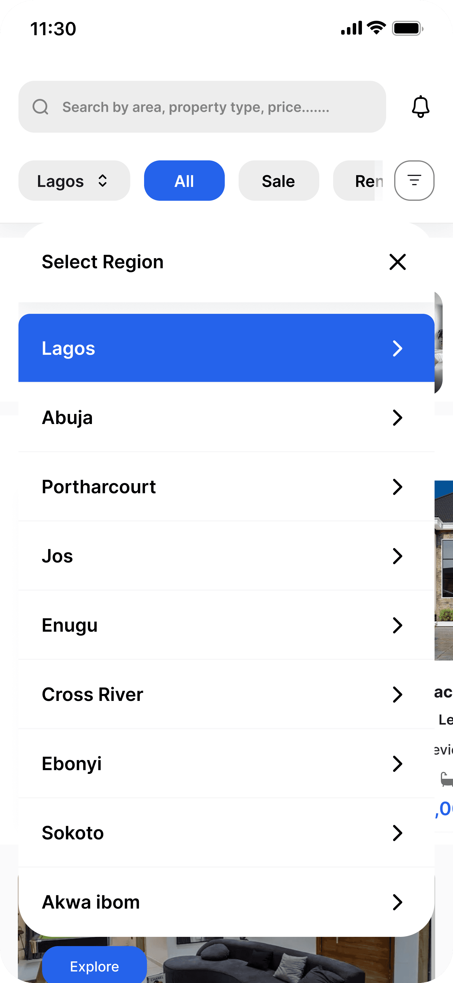
Users were confused about changing locations and selecting regions. The location selection needed to be clearer and easier to access.
Some users struggled with filtering properties and refining their search results. The filter structure needed to be simplified and more intuitive.
Users did not immediately understand the difference between community posts and direct messages. The navigation and structure needed clearer separation.
The clear version :
On this step, first I created a static, high-fidelity Nestify's app design (keeping in mind all the conclusions from the previous phase of usability studies) that is a clear representation of a final product called design mockups.
After that, I created a high-fidelity prototype of the app.
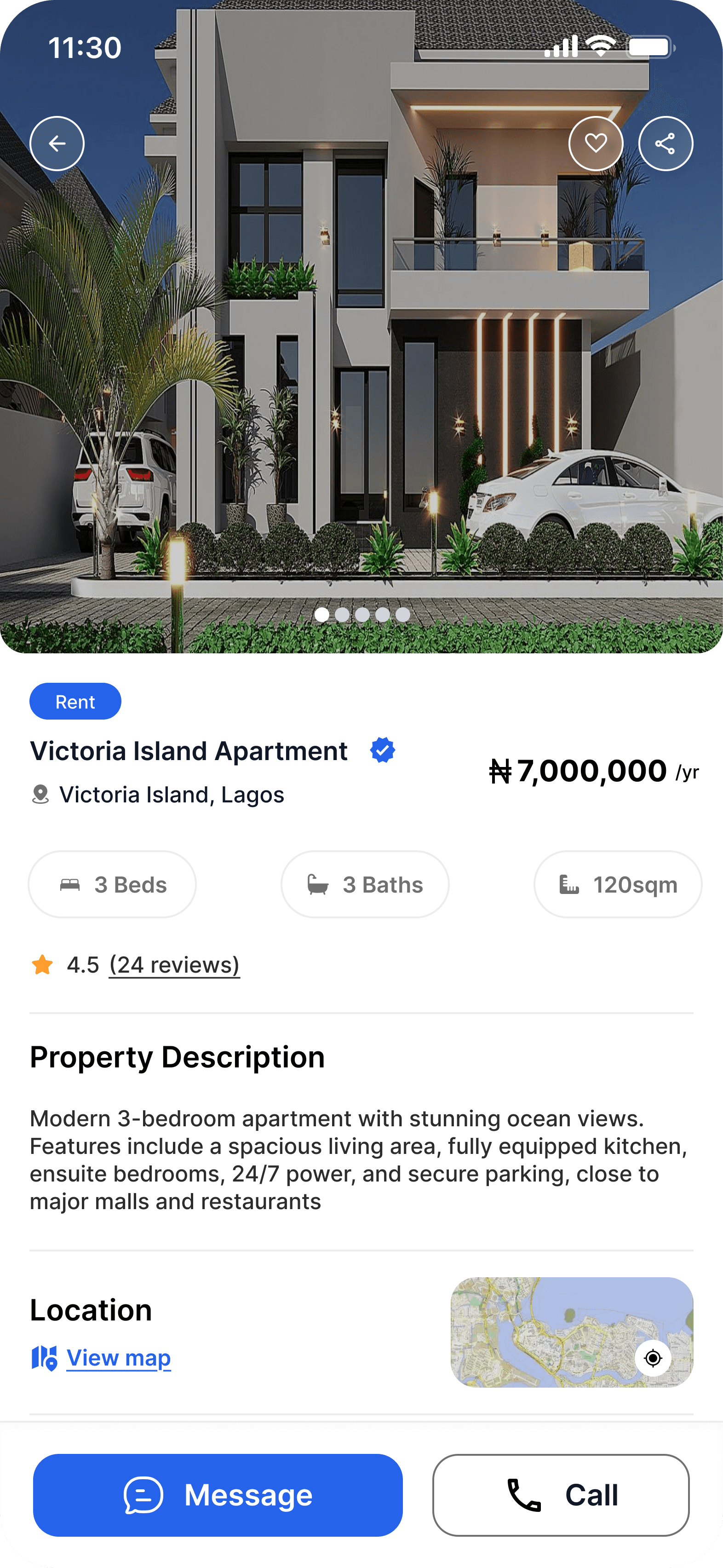
These are a high fidelity design that represents a final product
I created all the app pages mockups, incorporating the right design elements such as typography, color, and iconography. I also included captivating and visually appealing images, and developed all the necessary components and elements.
The goal was to demonstrate the final Nestify's app in as much detail as possible.


It's the detailed, interactive version of designs that closely match the look and feel of the final product.
I turned my mockups into a prototype that's ready for testing, using gestures and motion, which can help enrich the user experience and increase the usability of the app.

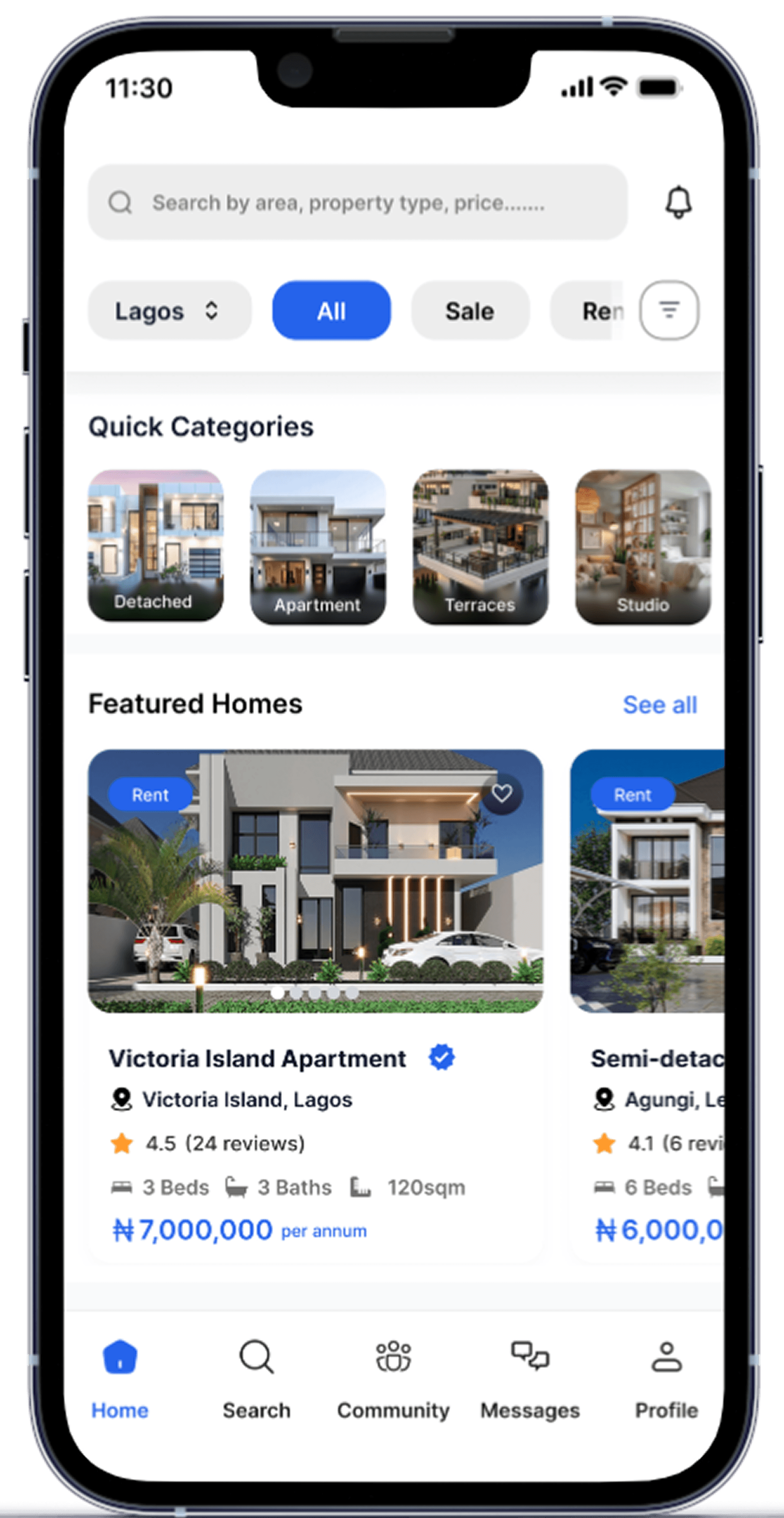
Location and property type selection
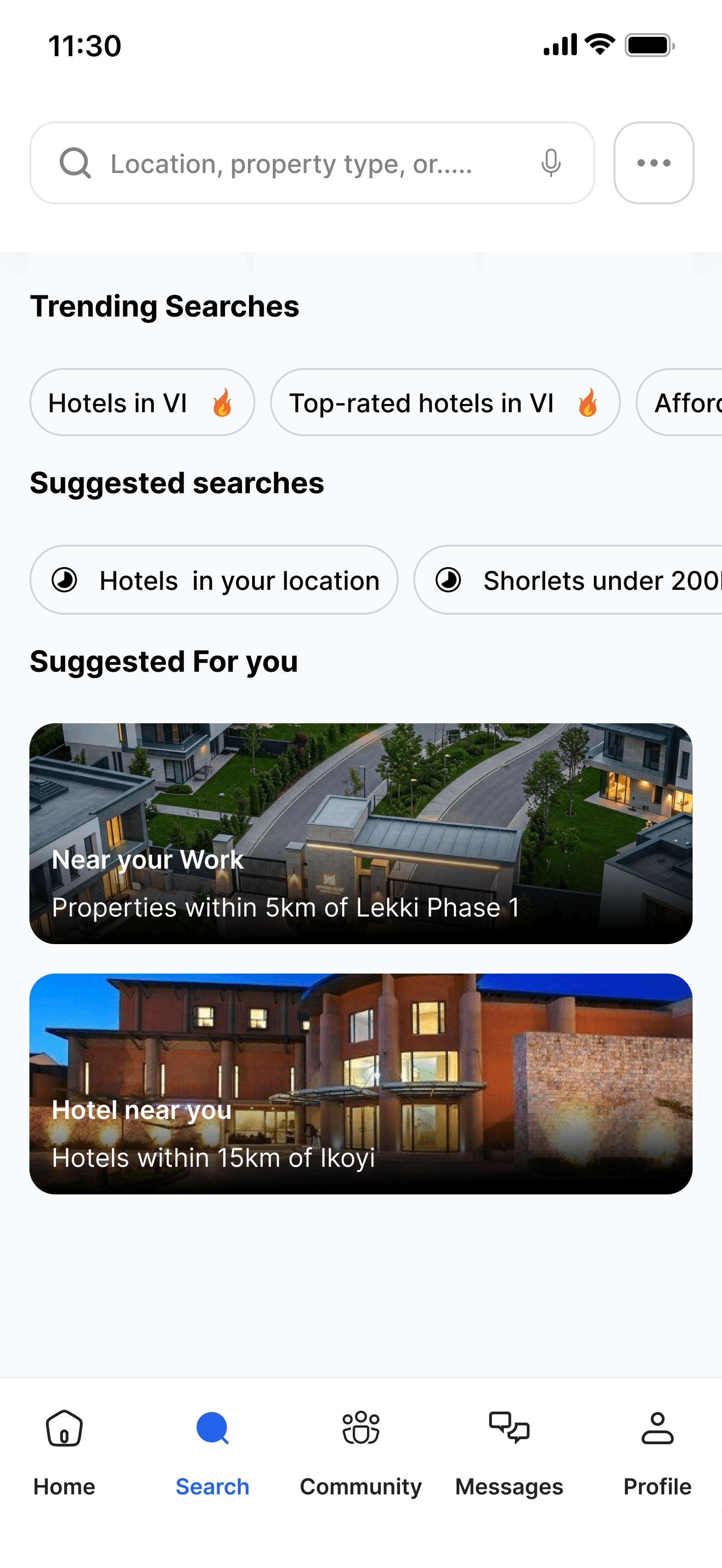
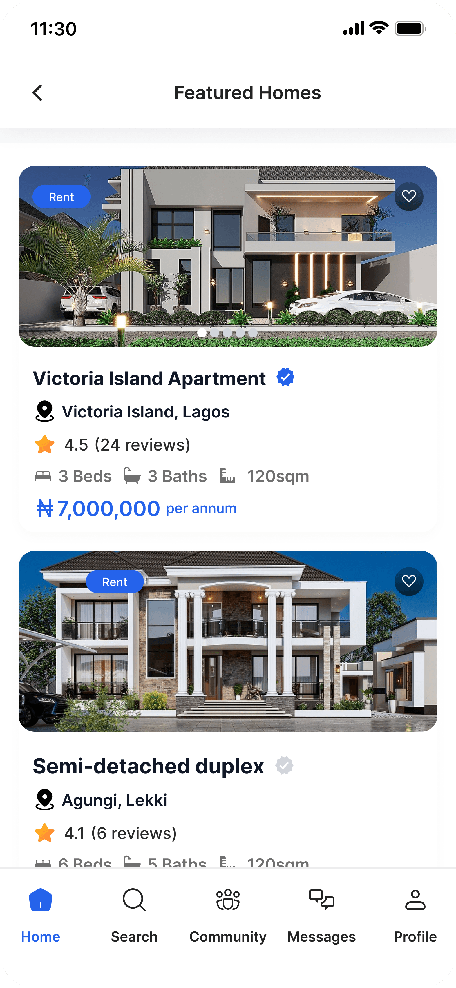
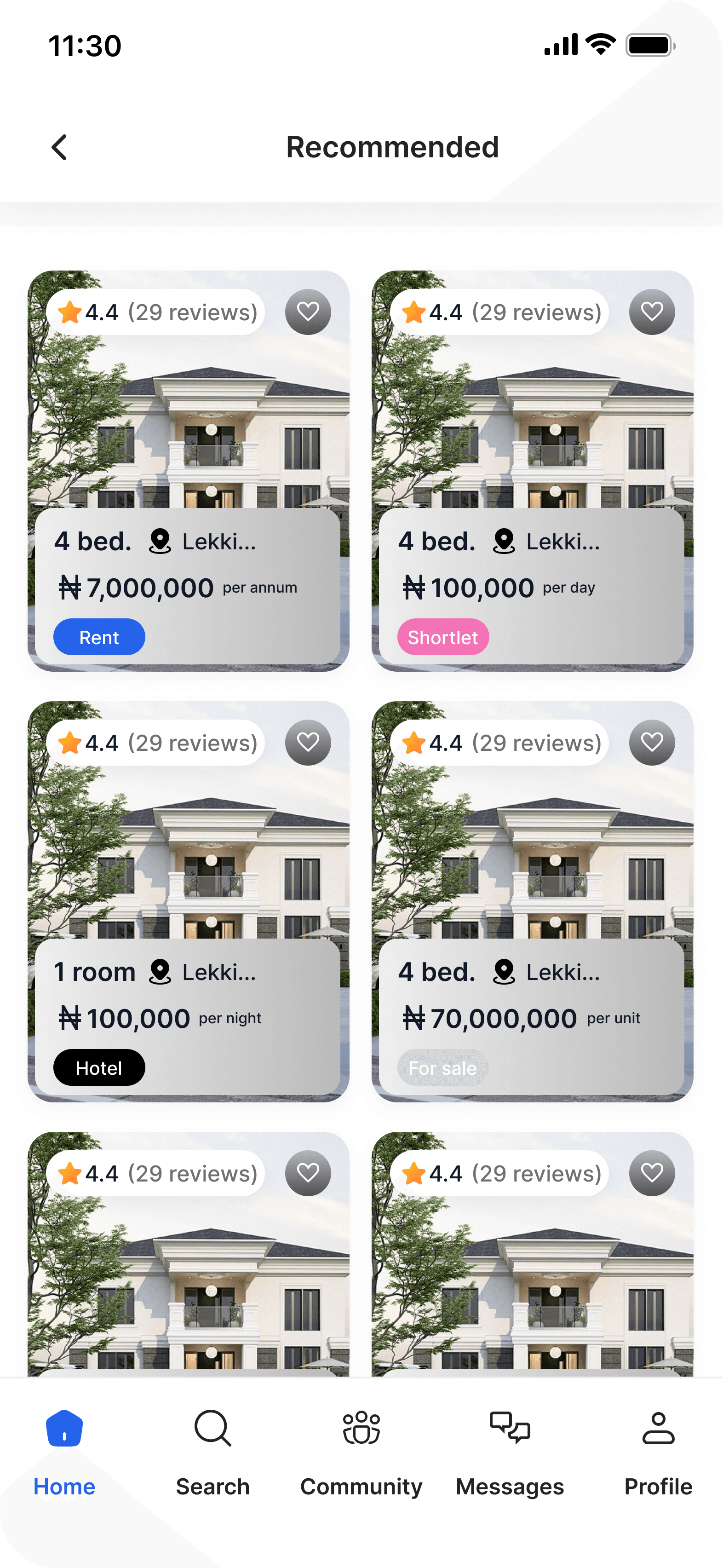
Browse featured properties on the home screen
Property search and suggested searches
Filter properties (price, region, bedrooms, amenities
Property details and save property
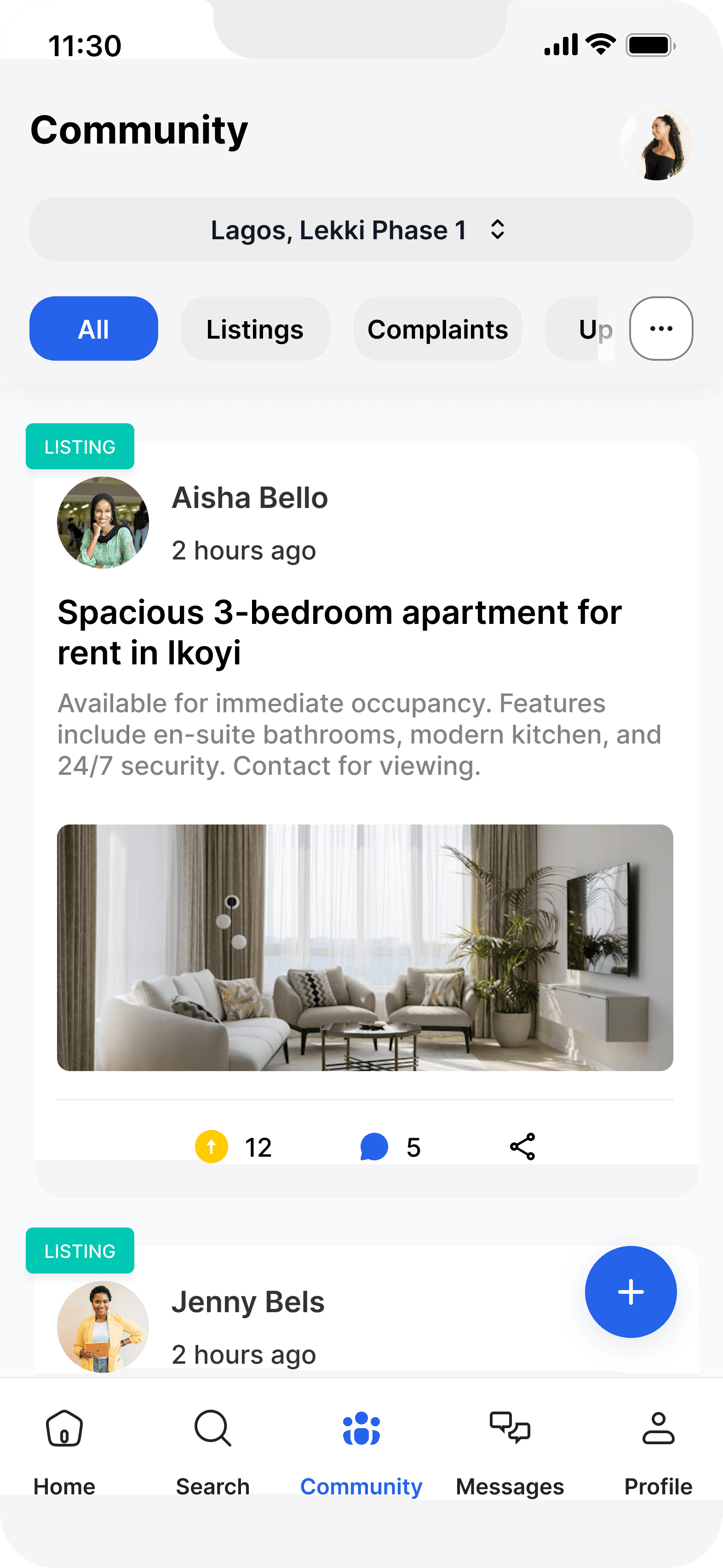
Explore community posts and listings
Direct messaging and community messaging
Profile and user activity management
The project schematically :
I created various diagrams and storyboards to clarify and analyze the app's information and architecture. Afterward, I sketched paper wireframes and then transitioned to digital wireframes, building a low-fidelity prototype to conduct initial usability studies with stakeholders.
This project showed the importance of combining property search, community insights, and messaging in one platform. Users need not just listings, but information and communication to make better housing decisions.
The final design improved navigation, simplified property search and filters, and made it easier for users to explore listings, interact with the community, and communicate with landlords.
I learned that small UX improvements in navigation, search, and filters can greatly improve user experience. Designing for the entire user journey is more important than designing individual screens.
The series of hand-drawing frames that visually describe and explore a user's experience with a product.
Conduct usability testing on the high-fidelity prototype
Explore additional features and improvements